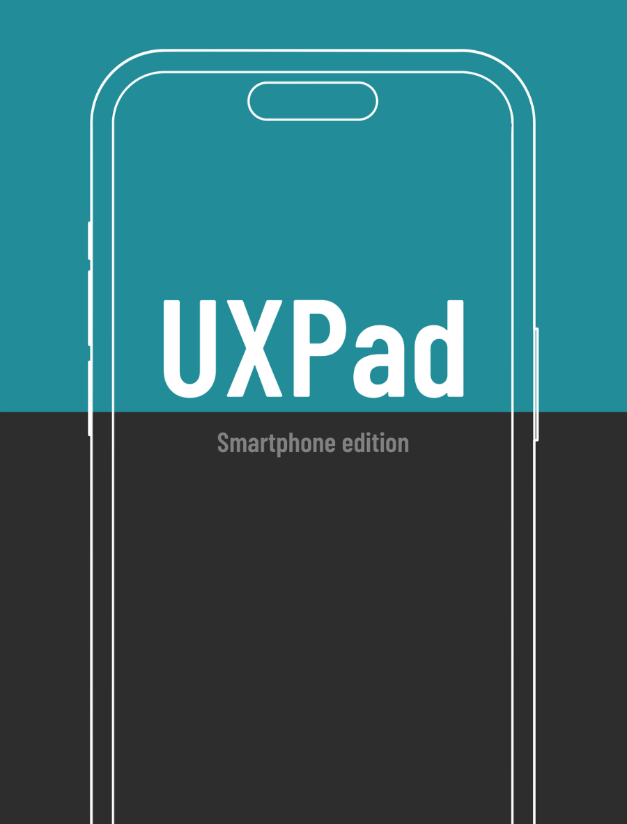
Smartphone edition
Phone frames for sketching mobile app screens, from single large screens to side-by-side flows, with space to name each screen and add notes.
Apps begin in sketchbooks, not screens
This notebook gives your early concepts a dedicated home, helping you shape ideas quickly before diving into pixels and prototypes.

Phone frames for sketching mobile app screens, from single large screens to side-by-side flows, with space to name each screen and add notes.
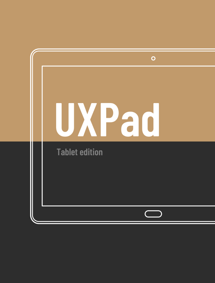
Tablet frames for sketching portrait and landscape layouts, split views and touch interfaces.
Desktop, browser and responsive web frames for sketching web apps, dashboards and sites.
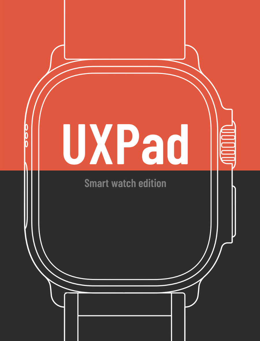
Square and round watch frames for single screens and multi-screen flows, each with space for notes.
Anyone who needs to get an app idea out of their head and onto a page.
Choose the edition that matches what you're building: smartphone, tablet, desktop and web, or smartwatch.
Draw screens inside the device frames. Name each page in the header boxes and add notes underneath.
Walk the team through the flow on paper, then take the agreed version into your design tool.

Jack is an engineering leader working across people, product and technology, with a background in AI and mobile apps. He created UXPad to give teams a quick, low-cost way to sketch screens before any code is written.
Pick the device you design for most. Each edition focuses on one type of screen, so the frames are the right shape and size for that device.
Blank device templates at a few sizes, from single large screens to multi-screen flows. Each page has boxes to name the screen and space underneath for notes.
All four editions are paperbacks sold on Amazon. The buy buttons link to your local Amazon store, and you can change the store if it picks the wrong one.